E-commerce case study · La Vie en Rose
Mobile shopping, from discovery to checkout
As La Vie en Rose grew rapidly online, I led the mobile-first redesign end to end: from client communication and content structure to low-fidelity wireframes and the final design handed off to developers. The goal was to help shoppers find products, understand gift offers and move through checkout.
Explore the design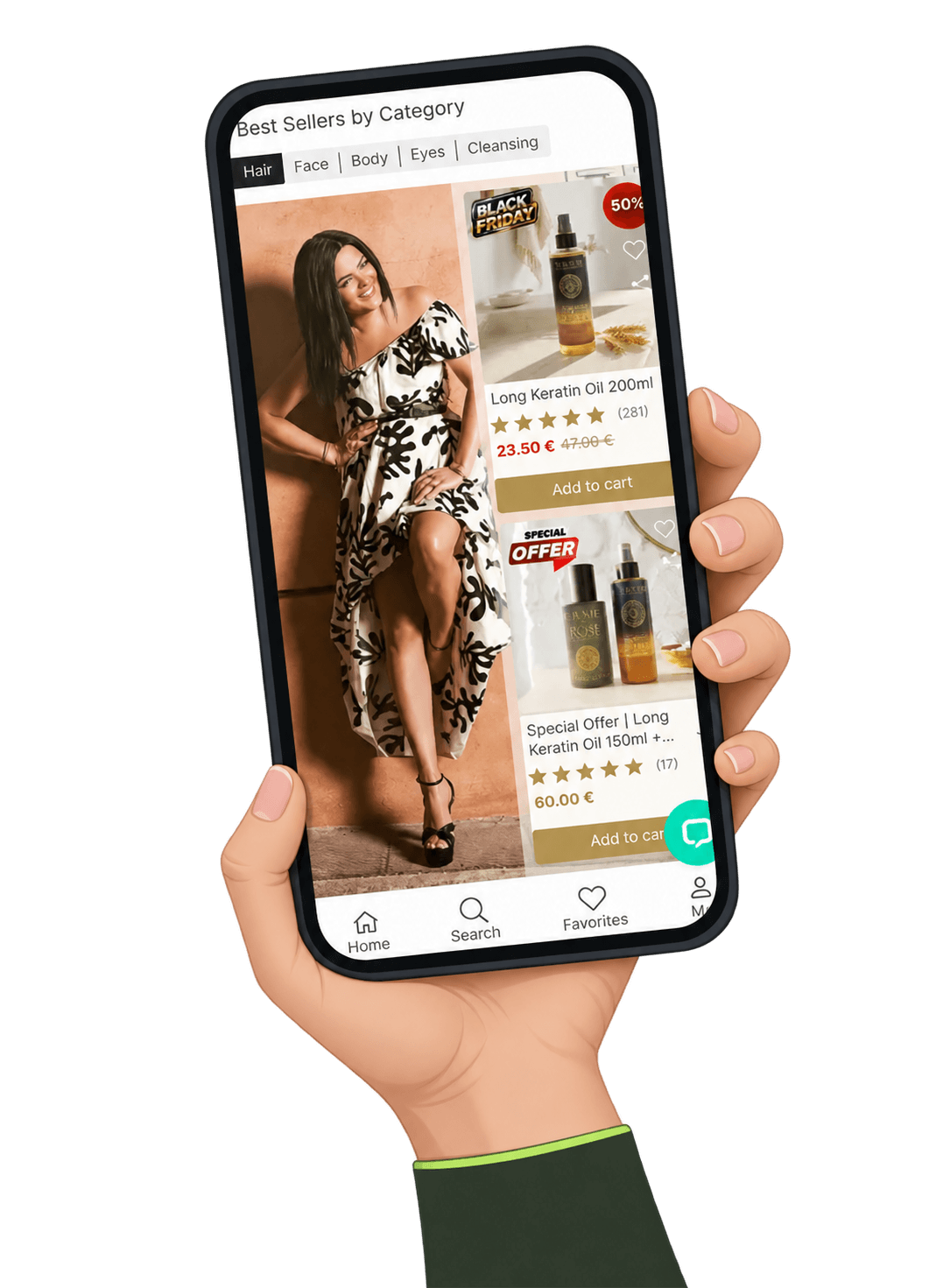
The problem
A fast-growing natural cosmetics store whose sales rely on frequent promotions. Shoppers had to find products quickly and understand which offer applied to them.
My role
Sole designer, end to end: client communication, content structure, low-fidelity wireframes and final UI design, handed off to the development team.
What changed
A mobile-first store with an offer system shoppers understand at a glance: 25% lower abandonment and 50% fewer support calls about offers.
The challenge
Many products, many promotions, one small screen
La Vie en Rose sells natural cosmetics through its stores across Greece and a fast-growing online shop. Sales depend on promotions that change often: percentage discounts, 1+1 offers, free gifts and gifts unlocked by the cart total.
On mobile, all of this had to fit on a small screen without confusing shoppers. They needed to reach the right category fast, see what each offer really includes, and trust that the gift would appear in the cart.
The process
From requirements to final mockups
01 · Align priorities
I ran the meetings with the client and marketing team to document business needs, promotion rules and the purpose of each page.
02 · Review the data
I used analytics and sales data to decide what deserves space first: which categories, offers and products shoppers look for most.
03 · Wireframe and discuss
Every key screen started as a low-fidelity wireframe, so we agreed on structure and wording before any visual design.
04 · Design and hand off
I turned the agreed wireframes into final mobile designs in Adobe XD and handed them off to the developers.
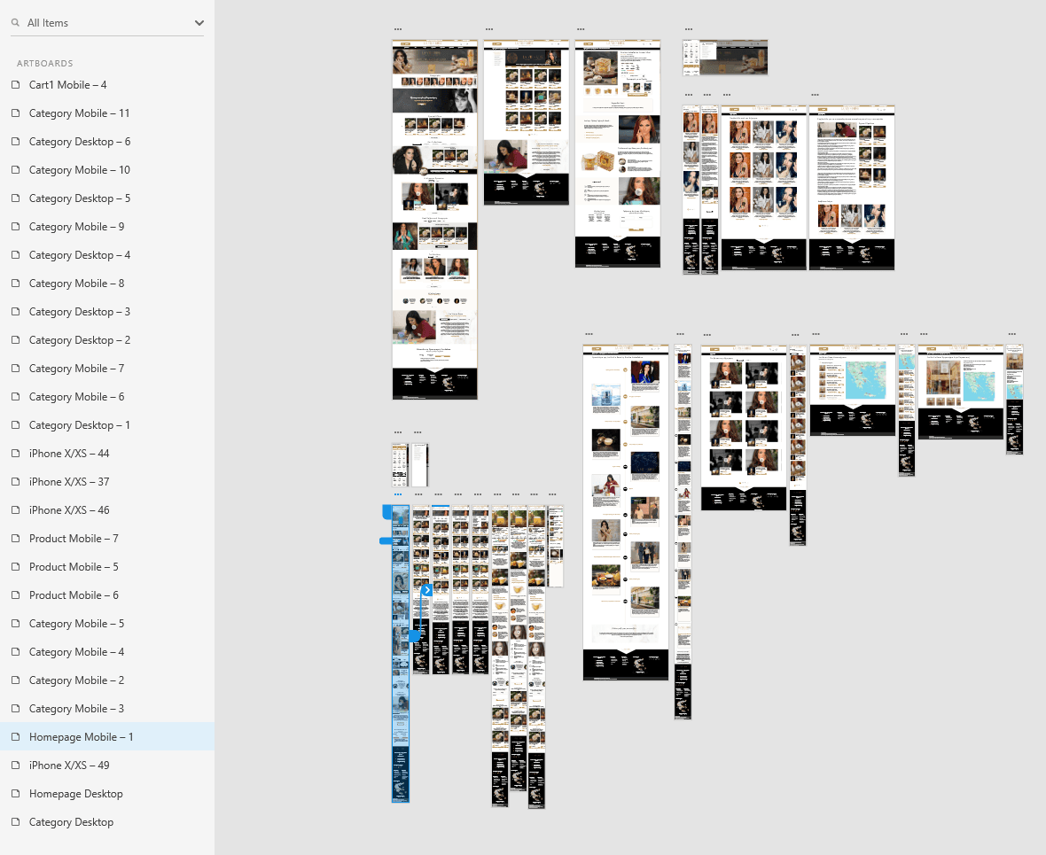
Six design decisions
Make the next step clear
All screens below come from my Adobe XD files. The store is Greek, so they appear in the original Greek, with short English notes under each one.
01 · Gift offers
Make each gift offer clear on the product page
Challenge
Promotions drive a large share of sales, but each one works differently. A gift that comes with one product and a gift unlocked by buying two can look the same at a glance. If shoppers can’t tell what they get and what they pay, they hesitate, or they add the wrong items and the offer never applies.
Design
I designed an offer card that sits right under the price, states the deal in plain words and shows the gift with its crossed-out price. When the offer needs a different action, the main call to action becomes the offer itself instead of a generic Add to cart, so the most profitable choice is also the easiest one.
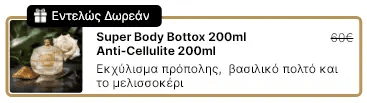
1.Completely free
The gift comes with the product. Add to cart stays the main action and the gift is added automatically.
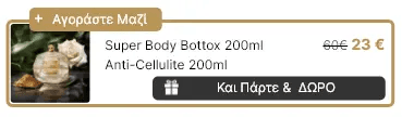
2.Buy together and get a gift
The second product at a reduced price unlocks a gift, so the filled button becomes “Or buy the offer”.
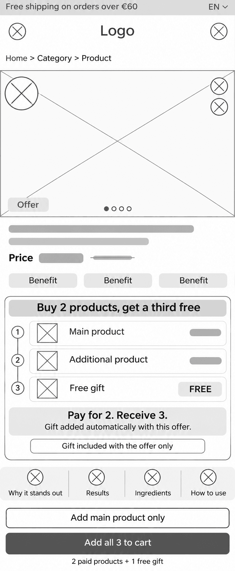
1 · Low-fidelity wireframe 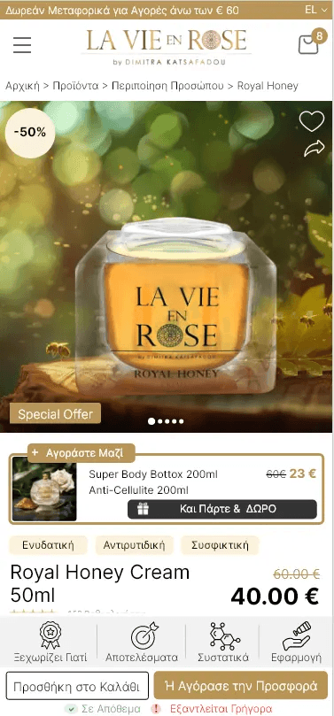
2 · Final design · Buy togetherButtons: “Add to cart” · “Or buy the offer” 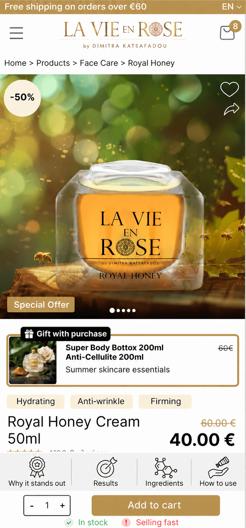
3 · Final design · Gift with purchaseEnglish version
02 · Cart and gift rewards
Show which gifts shoppers qualify for
Challenge
Different cart totals unlocked different gifts, and changing the cart could change which gift applied. Shoppers should never wonder what is free, how close they are, or why it changed.
Design
Two separate progress bars: one for free shipping, one for the gift, each with a plain message such as “Add €18 more and get your GIFT”. Right below, a suggested product shows exactly what to add to unlock the gift, with one tap to add it.
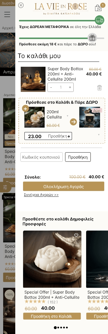
Final design · Cart“You have FREE SHIPPING” · “Add €18 more and get your GIFT” · “Add to cart & get a GIFT”
03 · Homepage and navigation
Put offers and categories up front
Challenge
Shoppers arrived looking for different things: a specific category, a current offer or a best seller. With dozens of categories, the menu risked becoming a long list.
Design
Offers and categories come first on the homepage, best sellers are grouped by category tabs, and the menu opens with the three offer types before a visual grid of categories. The most-used paths are always one tap away.
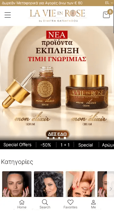
HomepageOffers bar and categories first 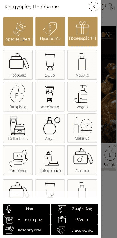
MenuTop row: Special offers · Offers · 1+1 offers 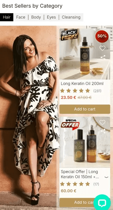
Best sellersGrouped by category tabs
04 · Category page
Help shoppers narrow down, and help the page rank
Challenge
Category pages had to show many products clearly on mobile, highlight offers and new arrivals, and also carry enough content to rank in search.
Design
Sub-category shortcuts sit right under the banner, sorting and the number of results come before the grid, and badges (New, Offer) stand out on each product with its own Add to cart. The SEO text sits below the product grid, so it helps search without pushing products down.
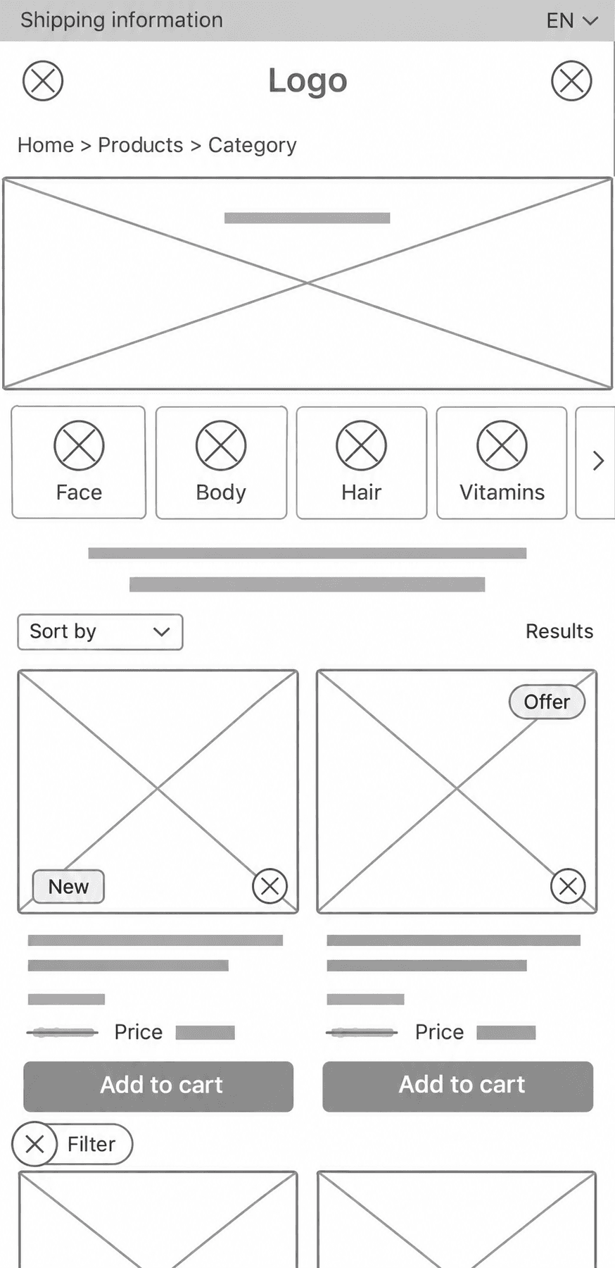
Low-fidelity wireframe
05 · Product page
Keep product details and buying within reach
Challenge
Results, ingredients and application instructions need room, but buying should never be more than a tap away.
Design
A sticky bar at the bottom keeps section shortcuts and Add to cart visible while shoppers scroll. “In stock” and “Selling fast” sit right under the button, adding honest urgency where the shopper decides.
1.Shortcuts to what shoppers look for
Why it stands out · Results · Ingredients · How to use

2.Stock and urgency next to the button
Add to cart · In stock · Selling fast

06 · My account
Make returning customers feel at home
Challenge
Returning customers needed to track orders, manage addresses and find saved products quickly, often on a phone, without digging through menus.
Design
Four icon tabs (Profile, Favourites, Addresses, Orders), with the active tab in black. Orders show their status with an icon (preparing, out for delivery, delivered), addresses can be marked for shipping or billing, and the profile includes an email and Viber/SMS opt-in for offers.
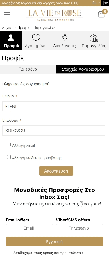
ProfileWith offers sign-up 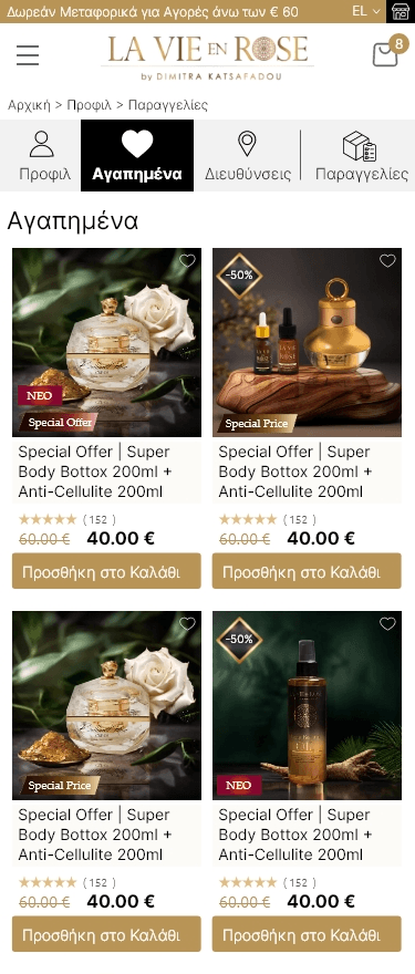
Favourites 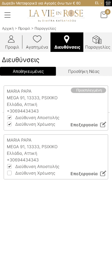
AddressesDefault, shipping and billing 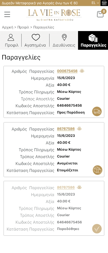
OrdersStatus: out for delivery · preparing · delivered
Delivery
What I delivered
Wireframes to final design
Low-fidelity wireframes agreed with the client, then final mobile designs in Adobe XD handed off to the developers.
A reusable offer system
One card pattern for every promotion type, so marketing can run new offers without a new design each time.
SEO built into the layouts
Room for search-relevant content on category and product pages, placed so it never pushes products down.
Outcome
Clearer offers, fewer drop-offs
−25% abandonment
After the redesign, the abandonment rate dropped by 25%, as shoppers could see what each offer included and what they would pay.
−50% support calls about offers
Calls to customer support about promotions and gifts were cut in half, because the offer cards and cart now answer those questions on screen.
Built to scale
New products and promotions fit into the same patterns, without redesigning pages for every campaign.
What I learned
Looking back
Design the offer, not just the page
Promotions change every few weeks. A reusable offer card scaled far better than one-off banners for each campaign.
Agree on wording at wireframe stage
Settling offer wording with marketing in low fidelity avoided rework later, when visual design is slower to change.
Clarity pays off in support too
Halving the calls about offers showed that clear UX doesn’t only help sales; it also takes pressure off the support team.
Next case study
StudyTours
School trip bookings, instalments and operations.